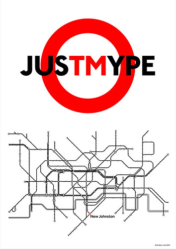
It's a lovely Typographic Tube Map by Eiichi Kono. Kono was commissioned by London Underground in 1979 to develop a new version of Edward Johnston's classic type. His version, New Johnston, is still in use today. Eiichi's typographic Tube map shows all* of the stations replaced with typeface and font names. (*Updated - oops - two are missing as West Hampstead Life notes).
Eiichi was from Japan and came to study graphic design in London in the early seventies. Of Johnston's original font he said "This elegant display type became known as the first humanistic sans serif, in direct contrast to the ubiquitous, over-weight, heavy-handed, tortured-looking Victorian grotesque sans. With ‘Johnston Sans’ and the Roundel symbol, London Transport’s corporate identity had achieved world fame by the 1930's."
You can see a larger version of Eiichi's map here. However, the whole thing is on display in Foyles Gallery (Charing Cross Road branch) until 19th November.

Kono-web by eyemagazine
It's part of a collection of typographic posters to coincide with the launch of Just My Type, a book of ‘stories about fonts’ by writer Simon Garfield. More information and images from Eye Magazine's blog post.
You might also like:
Where do Tube font designers go for inspiration
Underground Film Map
Daily Mail as a Tube Map
0 comments:
Post a Comment