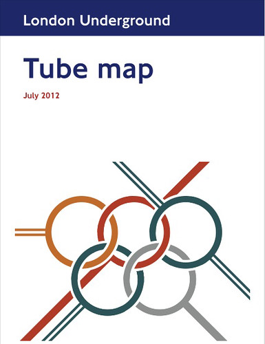
Max says "The logo itself doesn't quite match the way in which the official rings are linked, this is because its actually based on Henry Beck's 60-degree map interchanges of 1940." If you went to Max's exhibition on alternative Tube Maps you would have seen versions on display there.
Max had lots of positive comments about the design at the exhibition but has heard nothing back from Art on the Underground, who he approached with the idea.

photo by Priscila Buschinelli
I'd be surprised if there isn't some version of an Olympic Tube Map cover in 2012 and I bet whatever we get will probably have those stupid mascots in it somewhere.
Max's design is clear, simple and effectively brings the Tube Map and the Olypmics together in an immediately recognisable way.
Last month Londonist published a post on some Olympic Tube posters that were also unlikely to be used officially.

Such a shame we're stuck with Wenlock & Mandeville, when there's a number of talented designers already producing Olympic mock ups which many Londoners clearly like. I'd love to know who sits in on the focus groups to give the thumbs up to the official stuff!
0 comments:
Post a Comment