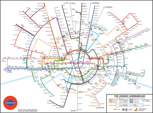
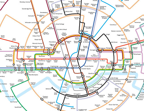
"With the new orbital loop surrounding Central London, some people are suggesting a mapping approach based on circles to emphasise this feature. There is nothing new here, and Berlin, Paris, Moscow and Madrid have all received this treatment in the past. Grounding a map in familiar shapes such as circles can make it easy to comprehend. However, it is also possible to push a design priority too far. As the old saying goes, be careful of what you might desire, in case you get it.
http://londonist.com/2013/01/a
"Let's start from first principles. Mixing straight lines and concentric circles on the same map is fine if there are pure orbital lines, and pure radial lines. This works well for Moscow, but in London the lines tend to be a bit of a mixture, never quite deciding whether they are heading for the centre or avoiding it. Circles are not particularly bothered about whether straight lines are at 45 degrees, vertical, or horizontal, with the consequence that the straight line and circular elements can integrate poorly, impacting on the harmony and coherence of the design. How can circles and straight lines be made to communicate better? Answer, by using straight lines that are directly related to circles: tangents and spokes (and, in emergency, lines that are parallel to other tangents and spokes). If a map is to be based upon concentric circles, then it might be an idea to rethink all the design rules from the ground up.
"If we really are going to throw away the design rules, and switch emphasis to orbital lines, then we need at least one full circle to make the concept convincing. However, forcing the Circle Line into this shape is a bad starting point. Its actual route is nothing like circular, and the British have a preference for nice orderly horizontal lettering, which tends to force out the width of the map. Going into battle on two fronts (geography and typography) simultaneously is just going to end in disaster: a horribly unbalanced design with areas of dense hard-to-decipher stations, and gaping holes in others. The Overground loop is far more suited to this sort of design abuse, and a much more interesting shape is possible for the Circle Line itself.
 |
| Max Roberts In Circles Tube Map - Sharp Corners - click to view full size |
 |
| Max Roberts In Circles Tube Map - Smooth Corners - click to view full size |
Overall though, I don't think I will be sending this one to TfL for comments. No great advances in usability here, but it was fun to make it."
What do you think of his maps? Fun? Usuable? Max would be keen to hear your thoughts. If you'd like to hear more from Max he'll be at the Design Museum of the evening of the 19th February giving a great talk - Underground Maps Unravelled - more details here.
You might also like
How to create a Topographically Reasonable Tube Map
Curvy Tube Map Re-visited
Alternative Tube Maps on Display
Has the London Underground Map Lost its way?
Curvy Tube Map Re-visited
Alternative Tube Maps on Display
Has the London Underground Map Lost its way?

0 comments:
Post a Comment