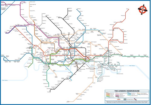
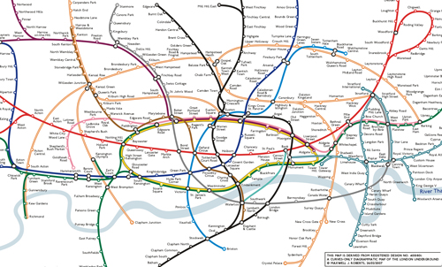
The topographical distortions of the London Underground map got into the news again a couple of weeks ago, thanks to Metro and the Daily Mail. The headlines distorted the story even more than the map distorts reality. We were warned that 30% of journeys were inefficiently planned, but that’s false. 30% of carefully selected special journeys trick people (a minority of people even then), most journeys on the Underground map are planned just fine.

Even so, the geography brigade are back in action. So, should the Tube map be topographically accurate?
If designing a topographically accurate map was easy, and the result looked nice, then we would have one. This alone should make people pause for thought. The London Underground is so dense in Central London, and so far-flung out into the suburbs that a scale map would be absurd. Even with the extremities of the Central and Metropolitan Lines cut off, it would need to around 1m by 1m, and even then the centre would be unreadable.
What alternatives are there? We can distort the map, squashing the suburbs in a bit, which is exactly what Henry Beck did. The problem is that if such a map is going to be informative, this has to be done properly. Everything has to be scaled and squashed correctly.
Rather than leaving the designer to work out how to squash everything accurately, we can try a mathematical transform using Photoshop. First, get your topographical map.
Now have a play with the "Pinch Distortion" filter (try the sphere distortion too, but the results are too freaky for our purposes). Set this to around -60% (see the image above), and you have a good enlarged centre, with recognisable suburbs. Where you centre the map makes a difference, but around Tottenham Court Road/Oxford Circus is a good choice.

Now, some people think that straight lines are special when designing network maps (especially 45-degree ones) so we can’t possibly stop with this messy version. Note though, London’s slight tilt. This will make the Central Line look like a flight of stairs, so 12-degrees of rotation clockwise (see above) will put this right.
Now we can create our Beck-rules schema. Bingo.

This map is not topographically correct, but it is the best you can get with reasonable size. I call this sort of design "spatially informative", look at any small section of the map, and all the stations are roughly in the right place and the correct distance from each other, but because the scale expands steadily going outwards, some care is needed. Watford to Watford Junction is not as walkable as Temple to Holborn.

Even so, I’ve still needed many compromises to schematise the transformed map (look at the Wimbledon branch of the District Line). An absolutely true schematic would have looked even worse, more zig-zags than the Paris Metro map.
Now we have a map that will stop people going from Paddington to Bond Street via Notting Hill, but it’s not a very nice design, with too many corners. The chaotic reality of the London Underground doesn’t translate directly into Beck’s rules very well. I would argue that the benefits of this map (no more errors for one or two rogue journeys) are outweighed by the costs (it looks ghastly, and it will be harder to use than a well-designed non-topographical map).
The whole point about a schematic map is it takes the complexities of reality and turns them into simple straight lines. Taking the curves of reality and turning them into a pile of zigzags simplifies nothing, the shape of the complexity has merely been changed. But I’ve never wanted to force a one-size fits all map on everyone. If anyone wants to use this map, I’m not going to stop them.
People who have been to my exhibitions will know that I argue that different map design rules suit different networks. 45-degree diagonals are adequate for London, but 60-degree ones might be better. It might be that a different set of angles will tame this map, but caution is required. Use too many angles on a map, thoughtlessly apply them, and there is a risk that it’s visual coherence will break down, and something really frightening could result.

I did have a go at a spatially informative all-curves map, trying to tame the ferociousness of the straight-line version, and focusing on key locations rather than slavishly following topography everywhere.

It’s not my favourite, and needs some more work. Curvy Tube map looks far nicer, even though it is not so topographically accurate, and it will still discourage people from going from Notting Hill to Bond Street via Notting Hill, which is where we came in.
Thanks Max for a great post - the full version of Max's thoughts on How to Design a Topographically Reasonable Underground Map can be seen here on pdf.
Related Posts
Curvy Tube Map Re-visited
Alternative Tube Maps on Display
Has the London Underground Map Lost its way?
0 comments:
Post a Comment