Let's start in 1944 with a classic poster from Fougasse (also known as Cyril Kenneth Bird)
I love the sympathetic approach here. Put yourself in the shoes of people trying to get off. How would you like it, if someone barged on before you.
1979, let's have a brief interlude with a trip across to Japan to see how they dealt with this.

Would a religious plea help? Let nuns off first. Don't mess with the hand of God! (more vintage Japanese subway manners posters here).
 Back to London. You might remember the kitsch "Love Is" posters that were all over the London Underground in 2003. One of them tackled this problem and proclaimed that "love is.... letting people off first." The "Love Is" couple are pictured trying to get off a train while and old lady with bags is trying to barge her way on (Excuse the image size, I can't find a larger version of this).
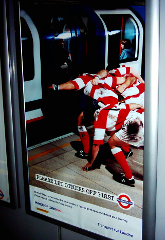
 Then in 2004 you'll have seen posters reminding you of the feeling that Tube travel is like a battle.

The rugby image works well. The copy's good too "Nobody likes a scrum when the doors open. It causes blockages and delays your journey. Please help us to keep the Tube moving".
Moving onto 2008, a different tactic was tried. London Underground started to experiment with "directional floor markings". Here's the thought process "Let's put some fluorescent yellow arrows on the platform floor. We won't bother explaining what they mean. People will naturally understand what they mean. We'll trial it for six months and we'll test varieties to see which ones work best."


Have you seen these anywhere recently? My guess is very people knew what they meant and it was quietly shelved.
It's not just TfL that have been having problems explaining how to let people off first. Last year Toronto newspaper The National Post tired of the barging behaviour on their subway. They produced a poster which they encouraged people to follow and print.

It's deliberately funny, but there's clearly too much detail. It'd never work.
Back to London and I'm not sure exactly when it was introduced, but it's post 2004 and TfL seem to think it's done the job up until mid March this year.

No bylines or extra copy, no cute cartoons, no photography. It's the clear road sign approach. It assumes that people know that the sign means "Give way to oncoming traffic" or in the Tube's case, simply "Give way".
So now, we've had over a decade of the 21st century, with sophisticated advertising techniques. A brand new poster has been launched in the last couple of weeks. TfL's creative agency must have sat round a table with the powers-that-be, scratching their heads, trying to think of what would work. Here's how I imagine the conversation might have gone:
TfL: We've been running poster campaigns since the forties and still loads of people don't get it. So we want something 'in your face'
Agency: You haven't used photography for a while, how about that?
TfL: Yes that could work
Agency: How about a celebrity?
TfL: We haven't got the budget.
Agency: How about Boris? He could give it some sort of authority
TfL: Too busy with Bikes and the Olympics.
Agency: How about someone that looks like Boris?
TfL: Possible - but he'd need to be cheap.
Agency: What about some irony or a joke?
TfL: Nah - nothing clever or anything that could be mis-interpreted. It needs to be straightforward and in your face
Agency: OK, no subtlety
TfL: We want something in big letters that jumps out and almost hits you in the face
Agency: Oooh! Can we test some cross platform animations or short films? It would be what people saw just as the train pulled into the platform.
TfL: No, we have to save those for paying clients or engineering works.
Agency: OK what about something with QR codes, so that people can scan them into their smart phones and get taken to an interactive site about how many delays are caused by people blocking doors and stuff.
TfL: QR what? Anyway nothing with smart phones, they don't work underground.
Agency: Erm, OK what about something that incorporates social networks. We've got a brand new social media guru. We can can put your Facebook page and Twitter account on the posters. Encourage engagement, build a community, use hashtags, get people to upload videos, check in on Foursquare. It is 2011
TfL (sighing): Community? It's the Tube, we're not a social network, you could just about call us a network. But we're not social. However, you're right it is 2011 - let's keep it simple, but make it very modern, cutting edge and NOW
Agency: OK so we're left with big letters, a Boris lookalike and something that jumps out in your face. Sounds .... er... great. We'll put our best intern with PhotoShop skills onto it.
So they did. Here's the very latest ad:

Wonder if it will work?

0 comments:
Post a Comment